Accessibility as a Priority
Post 3 of 6 about building Rainbow Tile Slide, a puzzle game I shipped to the App Store in September. I'm a product manager, not an engineer. Claude wrote every line of the code. I made the decisions, played it on real hardware, and filed the bugs.
I started this project by writing a plan, then writing down what mattered to me about the game. Reading the plan back against those priorities, there were four things it didn't answer. Three were about the game itself. The fourth was about who could play it.
SWIPE
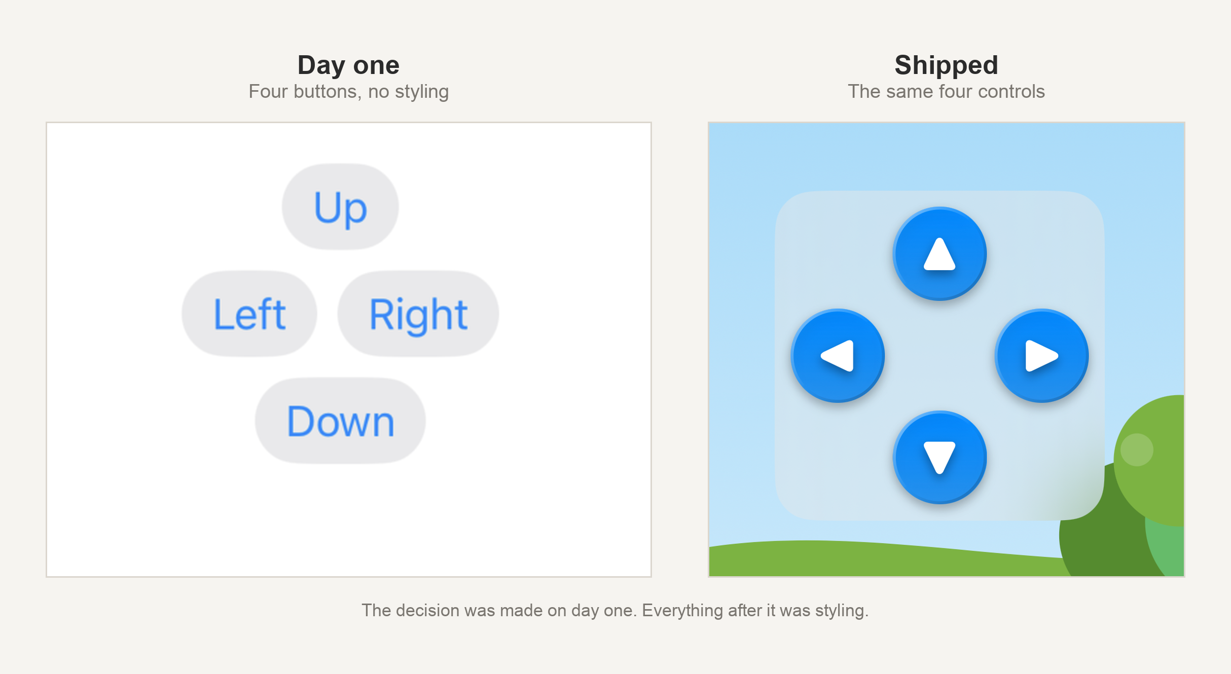
Under controls, the plan said: swipe. That was the whole input section. Swipe up, down, left, right. It's how every version of this puzzle works.
But a game that can only be played by dragging a finger across a screen can't be played by someone using a switch, or a head pointer, or anyone whose hands don't do precise dragging on demand.
So on day one, I added an on-screen D-pad alongside swipe. Four buttons, always visible, doing exactly what the swipe does. Not a settings toggle, not an accessibility mode buried somewhere. Both inputs, always, for everyone.
That decision cost me about ten minutes of thinking and it shaped the next five weeks. The D-pad takes up real screen space, which meant every layout problem I hit after that was a problem about fitting a board and a D-pad onto a screen together.
Color, Measured
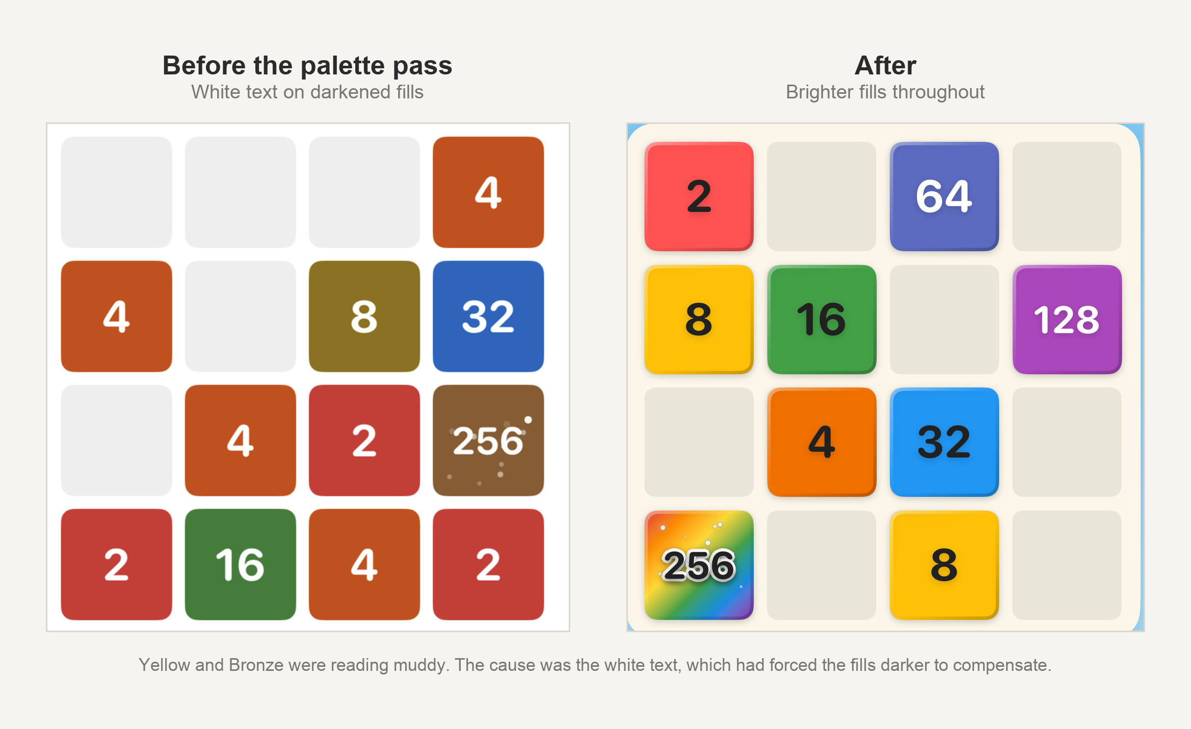
The tiles are the whole visual identity of this game. Bright colors, meant to look like construction paper. They are also the thing a player reads a number off. So the palette mattered A LOT.
A few days in, I asked for a round of cosmetic improvements on the tutorial. Brighter green for the page dots. A lightened, glossier orange for the arrow and hand icons. More pop. Friendlier. Every one of those requests made the real contrast measurably worse.
Contrast gets measured as a ratio. Black text on white paper is 21 to 1. Text exactly as bright as whatever sits behind it is 1 to 1. WCAG puts the minimum for ordinary body text at 4.5.
The numbers, once I ran them: the tutorial's body text was at 2.6, because it used the system's default secondary color, which is built for plain white backgrounds rather than a sky-blue gradient. The bright green dots I'd asked for came in at 1.2. The glossier orange icons measured 1.0. At 1.0, an icon and the background behind it are the same brightness, and the only thing separating them is hue. Color alone isn't supposed to be doing that job.
All of it got fixed with darker, richer versions of the same colors. The body text went from 2.6 to 4.9.
It also taught me something about my own palette. Some colors can be lightened a long way and still read as themselves, and some cannot. Lighten a violet far enough to help the contrast and it stops being violet. A few of my tiles had almost nothing left to give.
"Make it pop" and "make it legible" sound like the same instruction and easily turn into opposites. I couldn't see the difference with my eyes. I had to look at the math.
A few days later I asked a question I'd been assuming the answer to. Does the Score and Best text at the top of the game screen hold up, or does it just look fine to me? It did not hold up. The score values had no color of their own, so they inherited the system default, which flips to white in Dark Mode. On a phone set to dark, my score was rendering white against a pale pastel sky, close to invisible. I had never seen it, because my own phone is set to light.
I turned on VoiceOver
By the middle of August there was an automated accessibility audit running against every screen, and it was passing. I had a green check mark and I believed it. Then I turned VoiceOver on and played the whole game myself, start to finish, and found more real problems in one evening than that audit had found in the whole project up to that point.
The first was a tile that lied. My easier mode shows a simplified rank number rather than the true doubling value, so a tile worth 4 displays a 2. I tapped a tile showing 2 and VoiceOver said "Orange 4." The spoken label was reading a different number than the one printed on the tile. If I hadn't turned on VoiceOver, I would never have found it.
The longest fight of the evening was the three little navigation dots at the bottom of the tutorial. VoiceOver couldn't find them, then could find them but couldn't activate them, then could activate them only on a tiny precise spot. Three attempts in, I described the failures in detail instead of just reporting that it was broken, and mentioned two annoyances I'd assumed were unrelated: focus jumping to the last slide's title while I was on the first, and having to swipe through far more content than one slide should hold.
All three had the same cause. The tutorial was built on a standard swipe-between-pages control, and that control keeps every slide loaded at once, not just the one you're looking at. VoiceOver reads whatever is loaded. So it had been reading all three slides the whole time, while I could only ever see one.
That's where I stopped trying to fix the dots and asked for something that would work properly both on screen and out loud. What came back wasn't a patch. Real Back and Next buttons, and one slide loaded at a time. The tutorial scored better afterward than it had before any of this started.
The test that never looked past the first slide
Five days later I went back to my tests to check whether they were covering every screen.
The tutorial test walks the slides one at a time and audits each one as it goes. It was also set to stop at the first failure. So it audited the first slide, found something, and stopped. It never reached the second slide or the third. Not on any run, ever, while reporting the same tidy result.
I went through the rest of the tutorial by hand, and forced the test to keep running past the first slide. There was a failure in there I had never seen: a blue I'd used on buttons across the whole app was too light for the white text sitting on it.
Text that stays on the screen
The same week, I went after something I'd been deferring. An iPhone lets you make text bigger. Six text elements on the Home screen, including the mode names and the high scores, were fixed sizes that never responded to that setting.
The fix was to make them scale, and to cap how far they can grow, because there's a point past which the screen runs out of room. I'd already met the other half of this problem: at bigger text sizes the New Game button ran out of room and its label turned into three dots.
Two days before submitting
Getting ready to submit, I asked whether anything else deserved testing, and realized the app had only ever run on my own two devices and some large simulators. So I spun up the smallest iPhone still supported at my minimum iOS version and opened the game.
The bottom row of the D-pad was below the edge of the screen. One of the four directions was unreachable, in both game modes.
The D-pad I had added on day one, specifically so that people who can't swipe could play this game, did not work on the smallest phone I supported. It had been that way for a while. I fixed it before I submitted.
The last screen I checked
The week I submitted, I ran one more pass on the parental gate, which was the last screen I built.
Being in Apple's Kids Category means any link that takes a player out of the app has to sit behind a real gate. Mine is a randomly generated multiplication problem you type the answer to. VoiceOver found four things wrong with it.
Opening it dropped me straight into an empty text field, so a screen reader user lands in a box to type in without having heard the explanation or the question. The screen never announced what it was. The math problem was read out as a row of characters rather than as a question, so nothing told you that you were being asked to answer anything. And getting the answer wrong silently swapped in a different problem, which meant a VoiceOver user would carry on solving a question that no longer existed.
The last one took three tries, and the order of operations mattered. Clearing a wrong answer also disables the Continue button, and the button still had focus, so VoiceOver announced the button dimming instead of the new question. What I heard was "Continue dim." Moving focus first, before clearing, was the only version that worked.
The build I had already uploaded didn't have any of those fixes in it. I cut a new one, checked all four again by ear on the device, and submitted that instead.
What I'd claim, and what I wouldn't
I want to be careful about how accessible I say this game is. Nobody has certified it. There's no audit body that has looked at it, and I didn't have the budget to pursue one. No VPAT, no WCAG rating, no accessibility certification.
What I have is a decision I made on the first day, to build a game that more people can play than a normal tile game. It cost ten minutes and one line in a plan, and then it turned up again in the art, in the tests, in the smallest phone I support, and in the last screen I checked before submitting. I'm glad I made that call, including all the parts where it turned into more work.
Rainbow Tile Slide is free on the App Store, with no ads: https://apps.apple.com/us/app/rainbow-tile-slide/id6805617800
This is post 3 of 6 about building it. The rest of the series is here.