Getting What Mattered into the Plan
Post 2 of 6 about building Rainbow Tile Slide, a puzzle game I shipped to the App Store in September. I'm a product manager, not an engineer. Claude wrote every line of the code. I made the decisions, played it on real hardware, and filed the bugs.
Before any code existed, I wrote a game plan. Modes, art direction, phases, roughly what order things would happen in. It was a list of what I was going to build. It said nothing about what I wanted to be true about the thing once it existed.
So I wrote that down separately. Family friendly, and fair to call a kids game without being boring or too easy for an adult. Calm, with fun surprises in it. Quiet, in the sound and in how much moves on screen. Playable by more people than a normal 2048 game is playable by. A cozy art style, nothing flashing or jarring. None of those are features. They're what I wanted the game to feel like.
Then I read one against the other.
Where the plan hadn't caught up
How big is the easier mode's board? The plan said "3×3 or 4×4?" I had written the question down and then moved on.
How does scoring work? Not defined. For either mode. The plan had a whole screen for high scores and never said what a score was.
How do you play this if you can't swipe? The controls section said "swipe" and stopped there. I only saw that as a problem because of the line about being playable by more people than a normal 2048 game. That gap alone is worth its own blog post.
Is this an iPad app? Unclear. It changes every layout decision that comes after it, so it isn't a small question. It also isn't a small opportunity, because a lot of kids play games on an iPad, and that's a good share of who I was building this for.
Making decisions
On Day 1, I decided that the easier mode got a 3×3 board, against Standard's 4×4, and became a mode you can pick at any time rather than something you unlock. Standard mode scores the classic 2048 way, cumulatively, and the easier mode scores by the highest tile you reach, with a separate scores list for each. An on-screen D-pad went in alongside swipe. iPhone and iPad, both, in version one.
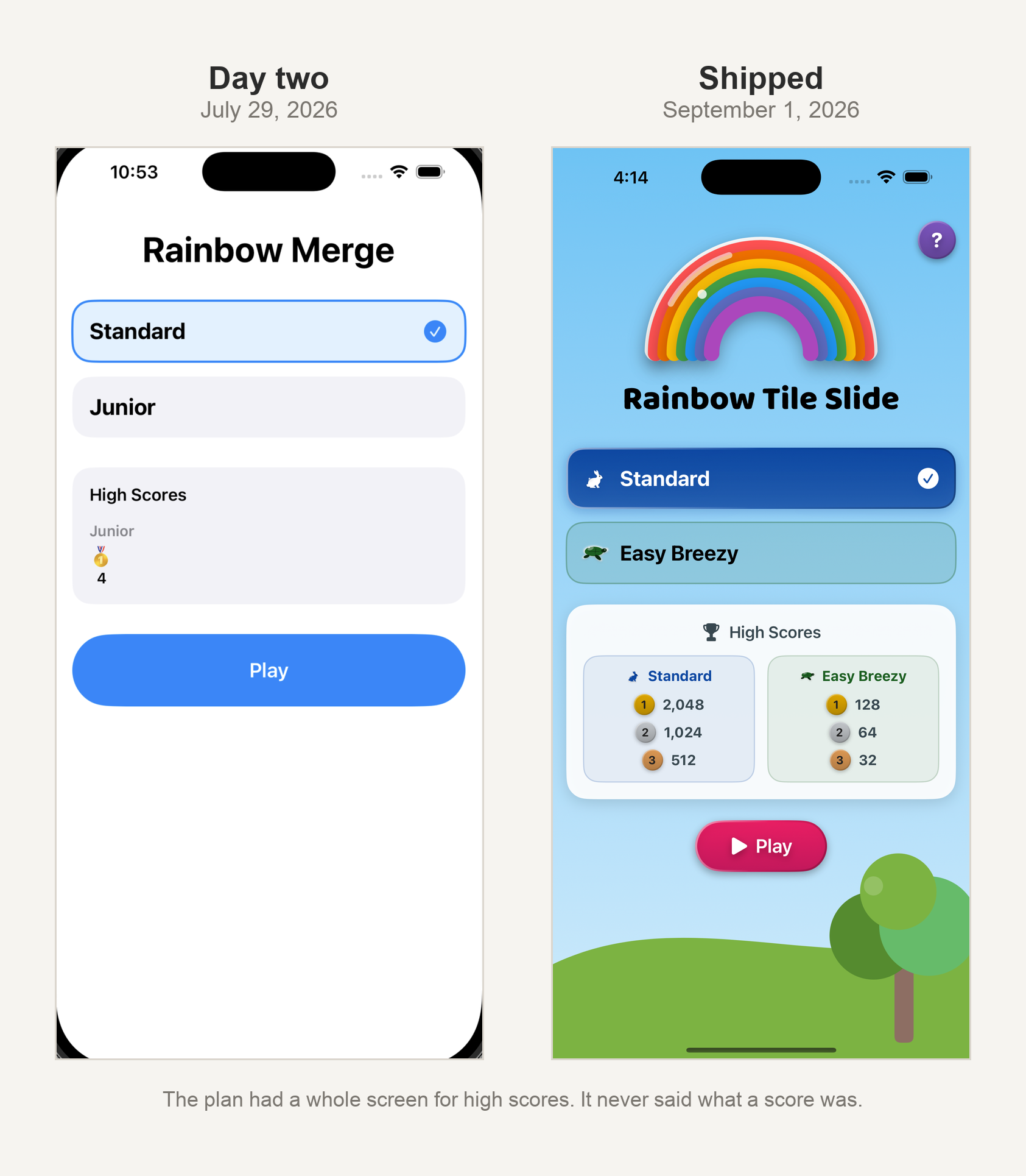
The one I got wrong
And that decision about ‘easy mode’ getting a smaller board, was not a good one to make.
I wanted the easier mode to feel gentler, more likely to appeal to kids or to anyone who wanted a less frantic pace. What I wrote into the plan was a smaller board. Fewer squares, fewer things to track, less to hold in your head. Then I played it.
A smaller board is harder. It fills up faster and there's nowhere to put anything. The mode I'd designed to be the calm one was the more stressful of the two, and I found that out by playing. So it got rebuilt. Same board size as Standard, and what makes it gentler is that new tiles arrive at half the pace instead.
How many more tiles?
I had made a first set of tiles to test with, and I wanted to know how many I'd need for a complete one. Every tile has its own color and treatment, so each one is real work. The answer available to me at the time was "a few more, probably."
I could have guessed a number and moved on. Instead I asked what the ceiling was. On a 4×4 board, what is the largest tile a person can ever reach?
There's a real answer. With the most generous possible run of luck in which tiles appear, 131,072. That is seventeen designs, counting up from 2. I knew what a complete set looked like, and I designed for that.
Why I'd do it this way again
My original plan changed quickly once I started building. The board size changed on day two, the app got renamed twice, and half the phases got reordered. That's what I'd expect. A plan that comes through a project untouched probably wasn't being used. I was able to learn from each decision and change, and my tools allowed me to pivot quickly.
Rainbow Tile Slide is free on the App Store, with no ads: https://apps.apple.com/us/app/rainbow-tile-slide/id6805617800
This is post 2 of 6 about building it. The rest of the series is here.